In the ever-evolving world of interior design, creating visually dynamic spaces is key to elevating both aesthetics and functionality. One fascinating phenomenon that designers are increasingly using to enhance spatial perception is Chromostereopsis, a visual effect that manipulates the perception of depth through color contrast. By understanding and utilizing this effect, designers can craft spaces that are both captivating and immersive. Let’s explore how Chromostereopsis can transform interior design and why it’s becoming a valuable tool for creating depth and dimensionality in spaces.
Chromostereopsis: The Science of Color Perception
What Is Chromostereopsis?
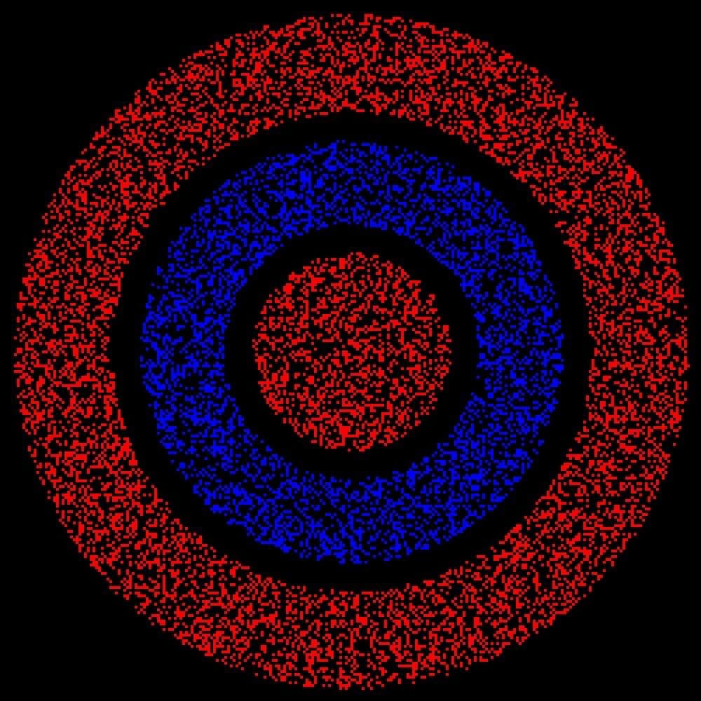
Chromostereopsis is a visual phenomenon in which certain color contrasts, particularly between hues with different wavelengths, create an illusion of depth. When two contrasting colors, like red and blue or yellow and purple, are placed next to each other, the eye perceives them as being at different distances, even when they are on the same flat surface. Colors with shorter wavelengths (like blue or violet) appear closer, while those with longer wavelengths (like red or yellow) seem farther away, causing a three-dimensional illusion.
Though the term “Chromostereopsis” was coined by German physiologist Ewald Hering in the 19th century, the phenomenon has been recognized for centuries. Leonardo da Vinci even mentioned how warm colors, such as red, tend to stand out, while cool colors, like blue, seem to recede. This effect can now be harnessed in design to manipulate how spaces are perceived, creating depth and texture in otherwise flat environments.
Chromostereopsis in Design and Visual Arts
Applications Beyond Interior Design
Chromostereopsis is not just limited to interior design; it is a powerful tool in many areas of visual communication, such as advertising, branding, and photography. By using contrasting colors, businesses and artists can create visual interest that catches the viewer’s attention.
In advertising and marketing, the use of Chromostereopsis can make posters, logos, or digital media appear more dynamic, pulling viewers’ eyes toward the focal points. Similarly, photographers use color contrast to create optical illusions, making flat images appear to have more depth.
In fashion, designers use color contrasts strategically to add dimension to garments. For instance, pairing short-wavelength colors with high-contrast details, like embroidery or accessories, can give the appearance of texture or movement, making a design feel more layered and intricate.
Chromostereopsis in Interior Design
Creating Depth with Color
Although Chromostereopsis is primarily observed in two-dimensional images, its principles can be effectively applied to interior spaces. By strategically using color contrast, designers can make rooms feel more spacious or create visual intrigue that makes an area seem alive with depth.
Wall Colors and Paint Accents
One of the easiest ways to introduce Chromostereopsis into a room is through wall colors. By combining warm and cool colors, designers can create a sense of depth. For example, painting one wall in a warm hue like red or yellow, while using cooler tones like blue or violet on adjacent walls, can make parts of the room appear to recede or pop forward. This creates a dynamic visual experience that engages the viewer and makes the room feel more dimensional.
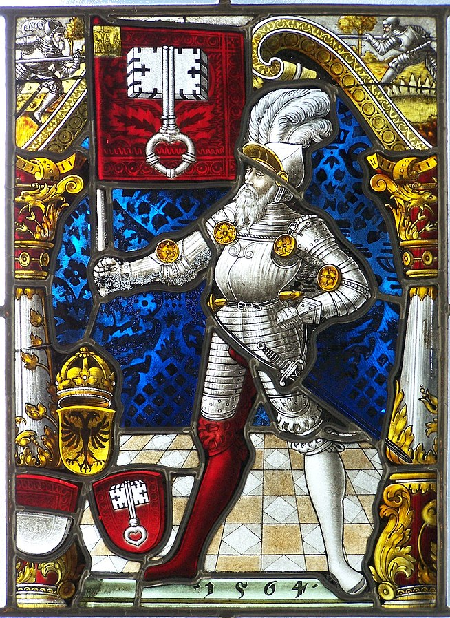
The Divine Knight stained glass painting uses contrasting colors from 1564. Photo: Zabytkowy Witraż
Furniture and Accessories
Furniture selection plays a key role in enhancing Chromostereopsis in a space. Using contrasting furniture and accessories with bold color pairings, such as a dark sofa contrasted with brightly colored throw pillows or accent chairs, can emphasize the dimensionality of a room. By balancing these elements, the space feels more layered and inviting.
Art as a Focal Point
Artwork is another excellent way to utilize the Chromostereopsis effect in interior design. Vivid, contrasting paintings or sculptures naturally draw attention while adding a sense of depth and texture to the room. By positioning art in areas that could benefit from visual interest, designers can enhance the overall atmosphere and provide focal points that make the space feel dynamic.
Author: awestories24.com